Static PDF survey reports lose up to 60% of their actionable insights because clients simply stop reading after the first few pages. That single fact is reshaping how chartered surveyors, property developers, and asset managers think about delivering findings to stakeholders. Interactive Client Dashboards from Survey Data: Elevating Property Reports Beyond Static Deliverables in 2026 represents the most significant shift in property reporting methodology in a generation — transforming traditional plats and condition schedules into dynamic, browser-based tools that invite collaboration, surface risk, and drive faster decisions.
Key Takeaways 📌
- Static PDF reports are being replaced by cloud-hosted, interactive dashboards that visualise zoning overlays, risk zones, and condition data in real time.
- Survey data becomes a living asset when connected to APIs covering ownership, valuations, flood risk, and market trends.
- Stakeholder collaboration improves dramatically when clients can filter, zoom, and annotate findings rather than passively read a document.
- AI-assisted dashboard tools now allow surveyors to generate branded, data-rich client reports in a fraction of the time previously required.
- Property professionals who adopt interactive reporting in 2026 will differentiate their service, reduce client queries, and support better-informed decisions on purchases, renovations, and investments.
Why Static Survey Reports Are Failing Clients in 2026
The traditional property survey report — a dense, text-heavy PDF delivered by email — was designed for a world where printing was the only distribution method. That world no longer exists. Clients today expect the same interactive experience from a property report that they get from their banking app or their estate agent's portal.
"A report that clients cannot navigate is a report that does not get used."
The consequences of unused survey data are serious. When a buyer ignores a structural warning buried on page 34 of a 60-page document, they may proceed without negotiating a price reduction or commissioning specialist investigations. As explored in detail on the consequences of failing to act after a survey, the financial and safety risks of overlooking survey findings can be severe.
The core problems with static deliverables include:
| Problem | Impact on Client |
|---|---|
| Linear, non-searchable format | Key findings are missed |
| No visual hierarchy for urgency | All defects appear equally important |
| No links to cost data or legislation | Client cannot act without further research |
| Cannot be updated post-delivery | Report becomes outdated immediately |
| No collaboration features | Solicitors, architects, and clients work from different versions |
Interactive dashboards solve every one of these problems simultaneously.
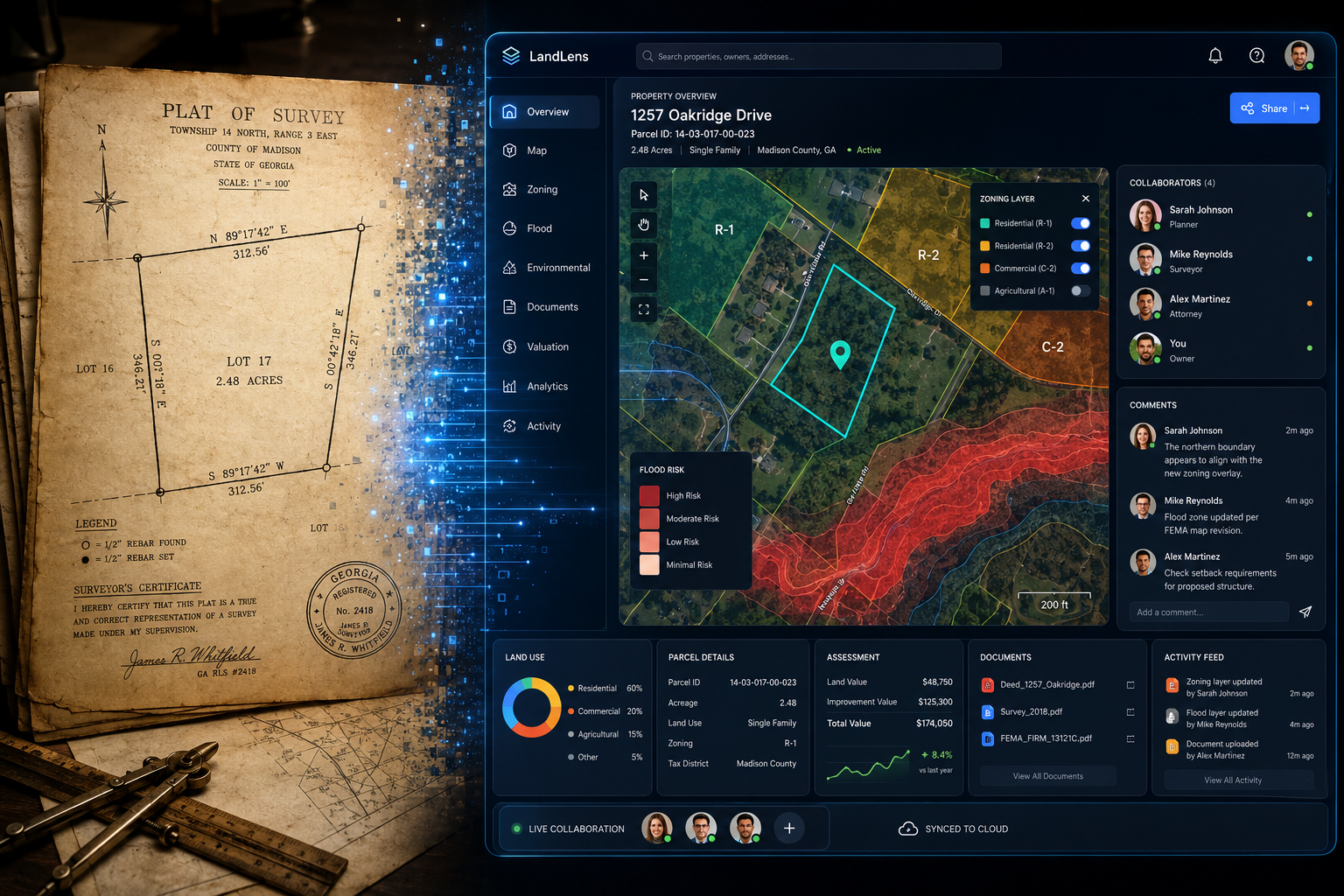
What Interactive Client Dashboards from Survey Data Actually Look Like
From Paper Plats to Browser-Based Collaboration Tools
The starting point for any interactive dashboard is the raw survey data itself — condition ratings, measured dimensions, photographic evidence, material assessments, and risk classifications. When this data is structured correctly and pushed into a cloud platform, it can be rendered as a dynamic, browser-based tool that stakeholders access via a secure link, with no software installation required.
Platforms such as PolicyMap already demonstrate what is possible: users create interactive dashboards that transform place-based data into visualisations for housing reports, community profiles, and health assessments [8]. The same principle applies directly to individual property surveys.
A modern interactive property dashboard typically includes:
- 🗺️ Zoning overlay maps — clickable layers showing planning designations, conservation area boundaries, and permitted development rights
- 🔴 Risk zone visualisations — flood risk, subsidence probability, and radon zones rendered as colour-coded heat maps
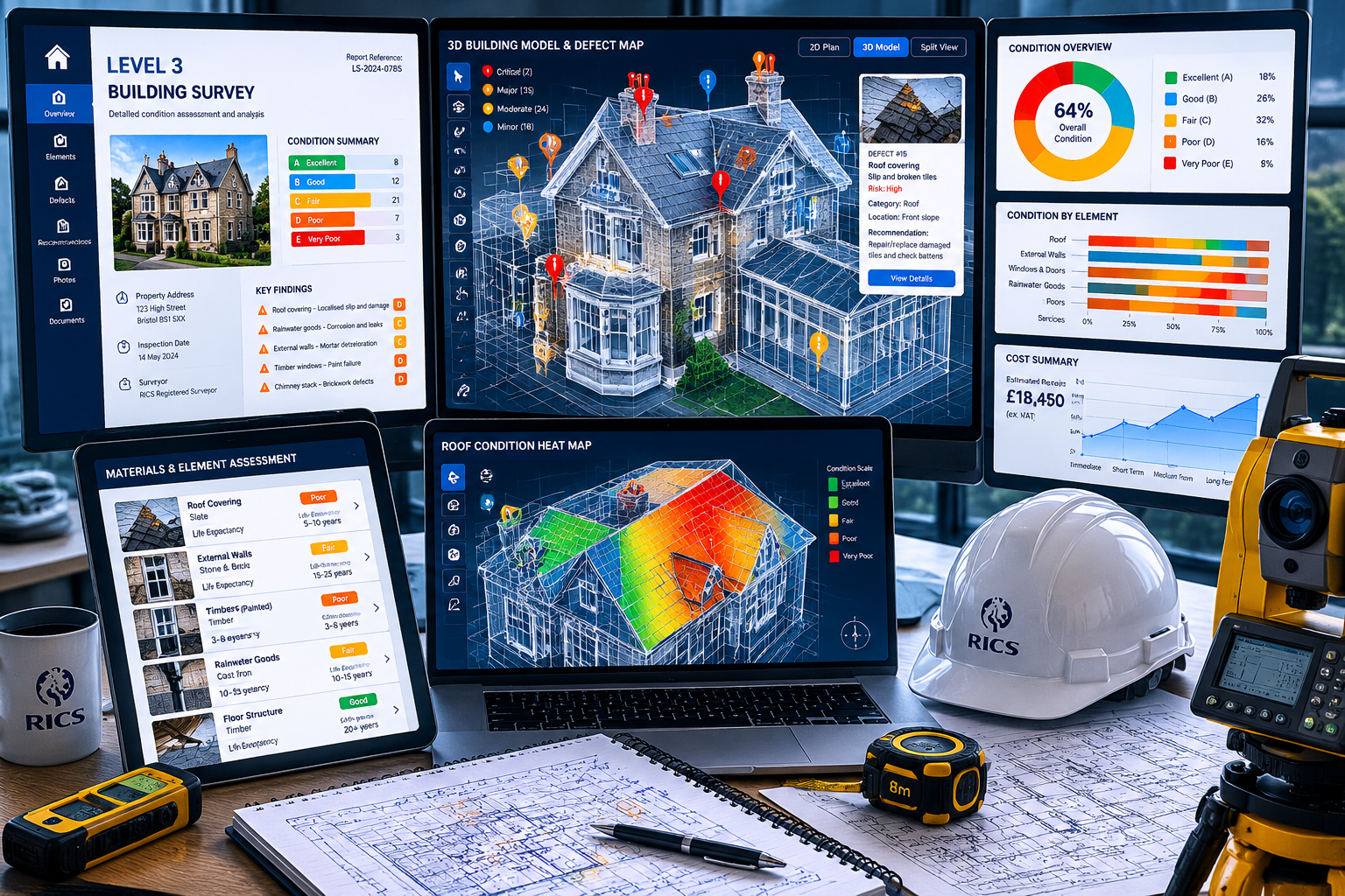
- 📊 Condition rating panels — traffic-light systems for each element (roof, structure, drainage, electrics) with expandable detail
- 📸 Geotagged photo galleries — defect photographs linked to their exact location on a floor plan
- 💰 Cost estimate integrations — indicative repair costs linked to condition ratings
- 📅 Maintenance timeline views — prioritised action lists with suggested timeframes
For a Level 3 Full Building Survey, this approach is transformative. A report that once required a client to cross-reference a written description with a separate photograph and then locate the element on a hand-drawn plan can now be experienced as a single, integrated, interactive view.
The Data Layers That Power Meaningful Dashboards
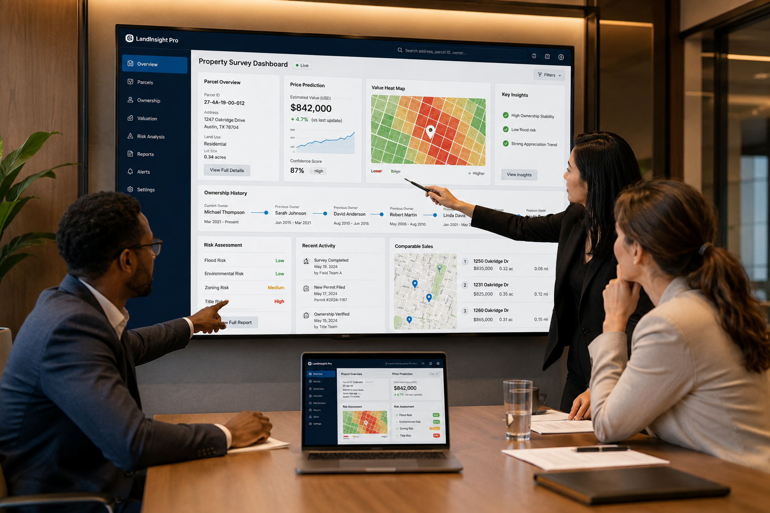
The richness of an interactive dashboard depends entirely on the quality and breadth of the underlying data. Leading platforms are now aggregating extraordinary volumes of property intelligence. ATTOM Data's acquisition of Estated, for example, provides access to datasets covering over 158 million properties, including ownership records, valuations, and market trends [2]. Revalo similarly offers parcel-level insights across 158 million parcels, with ownership information and opportunity analysis accessible through interactive dashboards [4].
For surveyors working on building materials assessments or construction and condition surveys, the ability to layer proprietary field data on top of these rich external datasets creates reports that are genuinely unprecedented in their depth and usability.
Home Insight Pro demonstrates the commercial appetite for this level of detail, delivering comprehensive property reports with over 50 data points — including roof data, structural details, and flood risk — starting at just $2.99 per report [3]. The market has clearly signalled that clients will pay for richer, more actionable data.
Building the Technical Infrastructure: Platforms, APIs, and Workflows
Choosing the Right Cloud Platform for Survey Dashboards
Surveyors and property consultancies do not need to build dashboard technology from scratch. A growing ecosystem of tools makes it practical to deploy interactive client dashboards within existing workflows.
Key platform categories to consider:
1. AI-Assisted Dashboard Builders
Tools like Bricks use artificial intelligence to generate real estate dashboards from property data, featuring occupancy rates, rental revenue, and portfolio analysis, with options for customisation and export [9]. For firms managing multiple properties or portfolios, this dramatically reduces the time cost of report production.
2. Automated Market Report Platforms
PropertySense offers branded, data-driven market summaries utilising data from Redfin, Zillow, FRED, and Census sources [1]. While US-focused, the model is directly applicable to UK firms seeking to add market context to individual property reports.
3. Price Prediction and Heat Map Tools
ClearValueRE provides real estate price predictions with transparent methodologies, comparing multiple statistical models and offering interactive heat maps for property analysis [5]. Embedding price trend visualisations into a survey dashboard gives clients immediate context for the condition findings.
4. Municipal and Community Data Platforms
CommunityScale's Housing Forecast app delivers interactive dashboards with demographic and employment trends, household income forecasts, and housing stock profiles [7]. For property development valuations, this type of macro-level data is invaluable when presented alongside site-specific survey findings.
Workflow Integration: From Field to Dashboard
The practical challenge is connecting field data collection to dashboard delivery. A streamlined workflow looks like this:
- Field data capture — Surveyors use structured inspection apps (tablet or mobile) that record condition ratings, photographs, and measurements against a standardised element library.
- Data validation — Automated checks flag missing data points or inconsistent ratings before the report is generated.
- Dashboard population — Survey data is pushed via API to the chosen dashboard platform, which automatically populates templates with the structured data.
- External data enrichment — APIs pull in flood risk, planning history, EPC ratings, and market comparables to add contextual layers.
- Client delivery — A secure, branded URL is sent to the client, with optional access controls for solicitors, architects, or lenders.
- Post-delivery updates — If a specialist investigation reveals new information, the dashboard is updated in real time rather than a new document being issued.
For firms offering insurance reinstatement cost valuations or commercial valuations, the ability to embed reinstatement cost calculations and comparable evidence directly into an interactive dashboard adds significant professional value.
Interactive Client Dashboards from Survey Data: Elevating Property Reports Beyond Static Deliverables in 2026 — The Stakeholder Collaboration Advantage
Why Collaboration Features Change Everything
One of the most underappreciated benefits of interactive dashboards is their ability to serve multiple stakeholders simultaneously without creating version-control problems. A traditional survey report is emailed as a PDF, then forwarded, printed, annotated by hand, and discussed over the phone — with each party potentially working from a different version.
An interactive dashboard eliminates this fragmentation entirely.
"When a solicitor, buyer, and architect can all view the same live dashboard and leave annotations on specific defect items, the transaction moves faster and with fewer misunderstandings."
Stakeholder-specific dashboard views can include:
| Stakeholder | Most Relevant Dashboard Panels |
|---|---|
| Buyer / Owner | Condition ratings, priority actions, cost estimates |
| Solicitor | Planning history, statutory notices, legal search overlays |
| Architect | Measured drawings, material specifications, structural notes |
| Lender | Risk zone overlays, valuation comparables, EPC data |
| Contractor | Defect photographs, access notes, specification details |
This multi-stakeholder capability is particularly valuable for complex transactions. Understanding what's included in a Level 3 survey becomes far more intuitive when clients can navigate findings interactively rather than reading dense technical prose.
Zoning Overlays and Risk Zones: The Visual Advantage
The transformation from static plat to dynamic browser tool is nowhere more powerful than in the visualisation of zoning and risk data. A written description of a flood zone designation or a planning constraint is abstract; a colour-coded overlay on a satellite map of the actual property is immediately understood.
Critical visual layers for property dashboards:
- 🌊 Flood risk zones — Environment Agency data rendered as transparent overlays
- 🏗️ Planning constraints — Conservation areas, listed building curtilages, Article 4 directions
- ☢️ Environmental risks — Contaminated land registers, radon action areas
- 📐 Zoning designations — Residential, commercial, mixed-use, green belt boundaries
- 🔧 Infrastructure overlays — Utility easements, rights of way, drainage responsibilities
For properties with complex planning histories, linking dashboard elements directly to statutory considerations and planning guidance within the dashboard creates a genuinely comprehensive reference tool that clients return to throughout the transaction and beyond.
Measuring the Business Case: ROI for Surveying Firms
Quantifiable Benefits of Interactive Reporting
The investment in interactive dashboard infrastructure is not purely altruistic. There is a clear and measurable business case for surveying firms.
Client retention and referral rates improve when clients feel genuinely supported by their surveyor. An interactive dashboard that remains accessible and useful throughout the conveyancing process — and beyond — creates a lasting positive impression that a PDF cannot replicate.
Reduced post-report queries represent a significant efficiency gain. When condition ratings are visually clear and cost estimates are embedded, clients need fewer follow-up calls to understand findings. This frees surveyor time for billable work.
Premium pricing justification becomes straightforward. Firms offering interactive dashboards can credibly position their service at a higher price point than competitors delivering static PDFs. The perceived and actual value difference is visible to the client from the moment they open the dashboard.
Data as a recurring asset is perhaps the most strategic benefit. Survey data collected today, stored in structured formats, can be aggregated to generate market intelligence, inform property investment strategies, and support future valuations for the same client or property.
Addressing Common Concerns
"Our clients are not tech-savvy enough."
Modern dashboard platforms are designed for consumer-grade usability. If a client can use online banking, they can navigate an interactive property dashboard. Mobile-responsive design ensures accessibility on any device.
"The setup cost is too high."
The ecosystem of off-the-shelf platforms means firms do not need to commission bespoke development. Many tools operate on subscription models with per-report pricing, making the cost directly proportional to revenue.
"Data security is a concern."
Reputable platforms offer enterprise-grade encryption, role-based access controls, and GDPR-compliant data handling. These protections often exceed those of email-based PDF delivery.
Conclusion: Actionable Next Steps for Property Professionals in 2026
The shift toward Interactive Client Dashboards from Survey Data: Elevating Property Reports Beyond Static Deliverables in 2026 is not a distant future trend — it is happening now, and the firms that move earliest will establish the strongest competitive positions.
Here are the concrete steps to take this year:
- ✅ Audit your current report format — Identify the three most common client queries after report delivery. These are the gaps your dashboard must fill first.
- ✅ Pilot a dashboard platform — Select one platform from the ecosystem (AI-assisted builders, automated market report tools, or parcel-data APIs) and run a three-month pilot on a subset of instructions.
- ✅ Restructure your data collection — Ensure field inspection data is captured in structured, machine-readable formats rather than free-text notes. This is the foundation of every dashboard capability.
- ✅ Identify your key data layers — Determine which external data sources (flood risk, planning, market comparables) add the most value for your typical client and integrate these first.
- ✅ Train your team — Dashboard delivery requires a modest but real shift in how surveyors think about structuring findings. Invest in this training early.
- ✅ Communicate the upgrade to clients — Market your interactive dashboard capability proactively. It is a genuine differentiator that clients will notice and value.
The property sector's most forward-thinking professionals are already treating survey data not as a one-time deliverable but as a living, collaborative asset. The technology to make this a reality is available, affordable, and proven. The only remaining question is how quickly your firm will make the transition.
References
[1] propertysense – https://www.propertysense.io/?utm_source=openai
[2] estated – https://estated.com/?utm_source=openai
[3] homeinsightpro – https://www.homeinsightpro.com/?utm_source=openai
[4] revalo – https://revalo.io/?utm_source=openai
[5] clearvaluere – https://clearvaluere.com/?utm_source=openai
[7] Dashboards – https://communityscale.io/dashboards/?utm_source=openai
[8] Dashboards – https://www.policymap.com/features/dashboards?utm_source=openai
[9] Real Estate Dashboard – https://www.thebricks.com/real-estate-dashboard?utm_source=openai